Logo Survey: Your Opinion Matters
Create your own user feedback survey
The current logo was developed by Elaine Ayres in 2006, and is meant to convey the idea of a vibrant, livable and healthy city. The colours symbolize the natural environment: blue for the sea and sky; and green for the grass, trees and plant life. Its two overlapping flourishes allude to the letter "V" as well as budding blossoms, ocean waves, mountain peaks, flying birds and sails. Their placement above the words suggest a spark or fireworks.
The move to replace the current logo is due to its incompatibility with modern forms of communication and social media channels. Moreover, some people, including those for whom English is not their mother tongue, find its meaning and symbology difficult to recognize or appreciate. The previous Mayor sought a new logo to reflect our diverse population and social, cultural and economic growth. We've had a go, and would appreciate your thoughts.
![]()
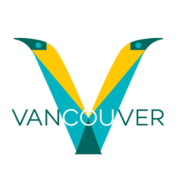
Our new design depicts Vancouver in a bold, geometric type based on the Campton font. The "V" includes a pair of yellow feathers rising from the lower triangle in the "V", which denotes Vancouver's green towers and trees. The green base continues throughout the word and outlines the elevation from the city on the left going north (right) to the mountains.
The upper triangles throughout the word symbolize light. They create a diversity of meaningful shapes, e.g. a nod to the Canucks in the "C", a central sunset in the "O", and mountains outlined on the right. The colours are drawn from the land, sea and sky to suggest Vancouver's natural beauty.
![]()
The "V" is derived from the beak of the Thunderbird, which is located in the centre of the City's Coat of Arms. The face of the Thunderbird is the core motif of the logo, and reflects the region's First Nations heritage.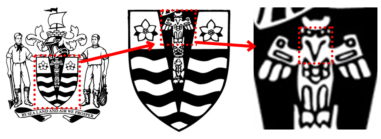
The letter V contains two feathers, which again reflects the Thunderbird. The rounded top of the "A" suggests a mountain peak, as does the background pattern in the "UVER" letters.
The top corners of the "N" are also slightly rounded, providing visual distinctiveness to the "van" prefix, while the rest of the City's name is squared at its corners. This gives a balance of feminine and masculine font styles.
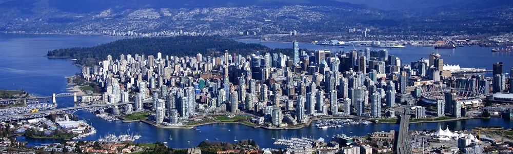
We've used the bold letters as a mural on which to draw parts of Vancouver's identity. This aerial view of Vancouver and the mountains to the north illustrate the topography of the region, as is depicted in the green base in the word Vancouver.

The low elevation from Vancouver (which is positioned on the left side of the logo at the first "V") to the northern mountains (on the right) is shown, as used in the proposed logo. We've also buried two gems in the hills and put a puddle in the "U" of renditions of the logo proposed here.

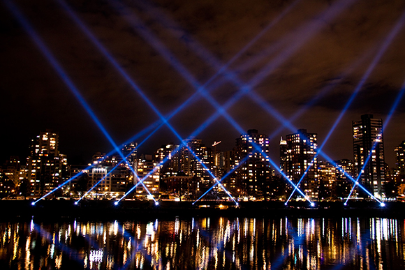
The lightshows held in the city inspired the geometric designs within the type used for the proposed new Vancouver logo. The breadth of the letters allows for superposition of many other colours and patterns to depict the diversity of cultures and feelings in the City.
We welcome your input as this remains very much an open, community-driven project. We'll share images for people to use on-line. We'll let you know as a consensus develops. Thank you for your vote and comments, and for your interest in improving Vancouver's image.
The design can easily be adapted for different departments or organizations. and can be rendered in black and white or on a coloured background. The monotone version retains the distinctiveness including the feathered "V" inspired by the Thunderbird.
Note on openness to citizen involvement
The successful branding of Vancouver depends on the role given to stakeholders.
Citizens are the most important of these, as they are core to the identity of the place, they act as ambassadors (if satisfactorily included), and they ultimately finance the effort (and can jettison it if excluded).
According to Kavaratis (1) "there is an urgent need to rethink the role of stakeholders towards a more participation and involvement-orientated practice" rather than being paid “lip service” or being considered a “necessary evil”.
In fact, it is apparent that "city brands that are developed behind closed doors and do not reach out to a wide range of stakeholders, fail".
A study by Eshuis and colleagues (2) shows that citizen involvement in the process is rare but, when it occurs, it enhances the quality of place marketing. Moreover the emotions and feelings of the commuity become integrated, leading to genuine outcomes.
In reality, it is the residents who are most able to communicate informal and authentic insider information to wide audiences according to Braun et al. (3). They are "living the brand", and are invaluable champions of the place. The development of an inclusive brand also provides a way to bring together diverse communities.
The best way to engage citizens is surprisingly easy. According to Zenker and Seigis (4), what citizens most want is to be asked for their opinions, and to have their views respected.
Participation should be enabled not just at the initial, visioning stage. Ideally there should also be accessible support of proposals and monitoring of their progress, as suggested by Zenker and Erfgen (5). This empowers the people, and can maximize the social and economic impacts.
References
1. M Kavaratzis, (2012) "From “necessary evil” to necessity: stakeholders' involvement in place branding", Journal of Place Management and Development, Vol. 5 Issue: 1, pp.7-19.
2. J Eshuis, EH Klijn, E Braun (2014) Place marketing and citizen participation: branding as strategy to address the emotional dimension of policy making? International Review of Administrative Sciences, Vol. 80(1) 151–171.
3. E Braun, M Kavaratzis, S Zenker, (2013) "My city – my brand: the different roles of residents in place branding", Journal of Place Management and Development, Vol. 6 Issue: 1, pp.18-28.
4. S Zenker, A Seigis, (2012) "Respect and the city: the mediating role of respect in citizen participation", Journal of Place Management and Development, Vol. 5 Issue: 1, pp.20-34.
5. Sebastian Zenker, Carsten Erfgen, (2014) "Let them do the work: a participatory place branding approach", Journal of Place Management and Development, Vol. 7 Issue: 3, pp.225-234.